Timeline Poster
This is a project I did for my Advanced Graphic Design class in the Spring of 2026. The purpose of this project was to create a poster that shows the timeline of something that spans at least 50 years. The poster needed to include at least ten events on the timeline with a description of what occurred during that time. Besides this, there were no restrictions on color, size, fonts, or any other elements.
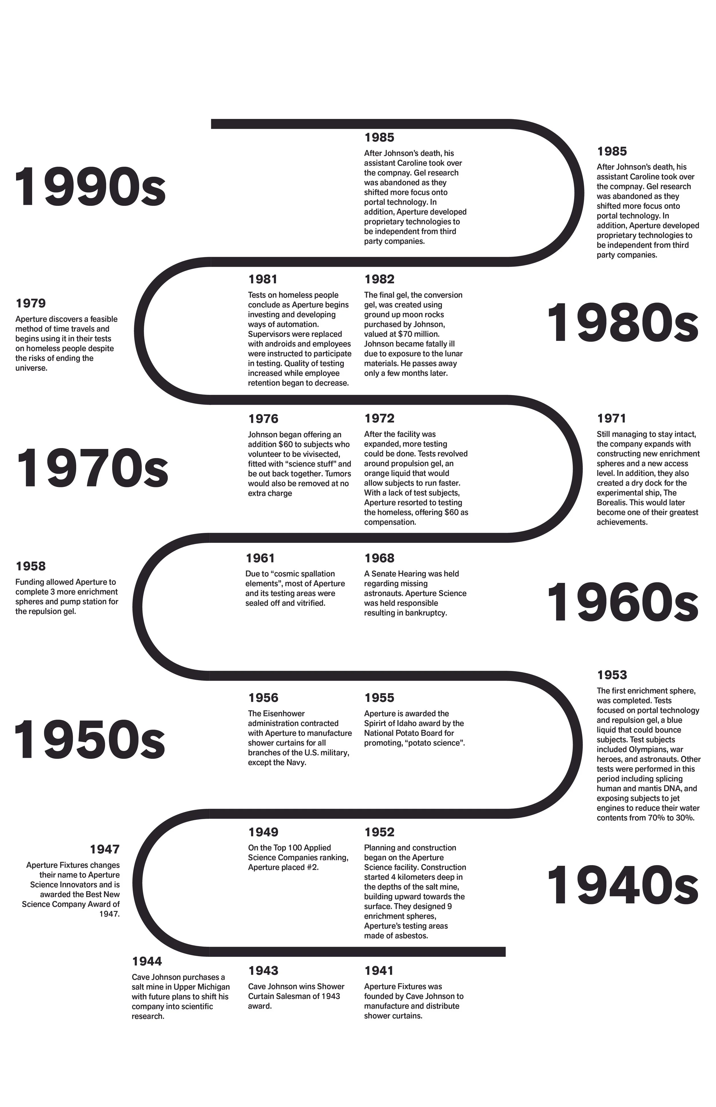
Because I am a fan of the video game series, Portal, I decided to use the fictional company in that game, Aperture Science, as the focus for the project. I would detail the history of Aperture Science from the founding of the company, up to the early 2000s.
Draft 1
I started with the basic structure of the poster. The timeline runs sort of backwards with the newer dates at the top and the older dates at the bottom. This is intentional as it is meant to reflect two things. Firstly, the company facility was created at the bottom of a salt mine and was expanded upon over the years as it was built up toward the surface. Secondly, in the game, the player begins the game at the top of the facility, the more newer area, and falls toward the bottom to the older area. As far as the style of the project, I wanted to emulate some of the posters seen in the game. These have more of simple, corporate aesthetic with basic sans serif fonts, simple shapes and colors, and silhouetted graphical elements.
Draft 2
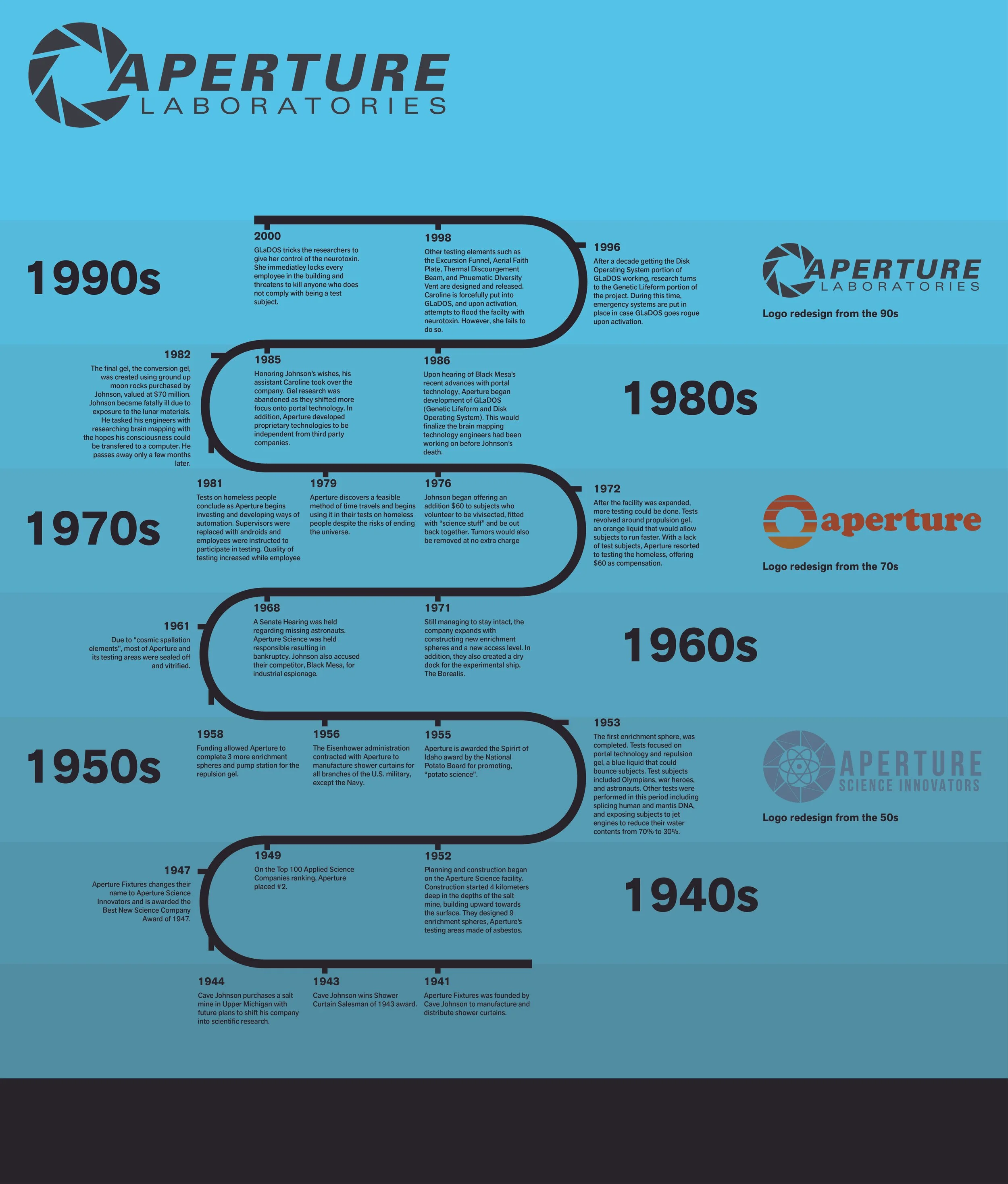
For the second draft, I expanded the size to add more elements like the company logos from the company’s history, and more empty space to make the poster feel less cluttered. I also added the different shades of blue to the background to represent both, the different decades as well as the different layers of the facility.
Draft 3
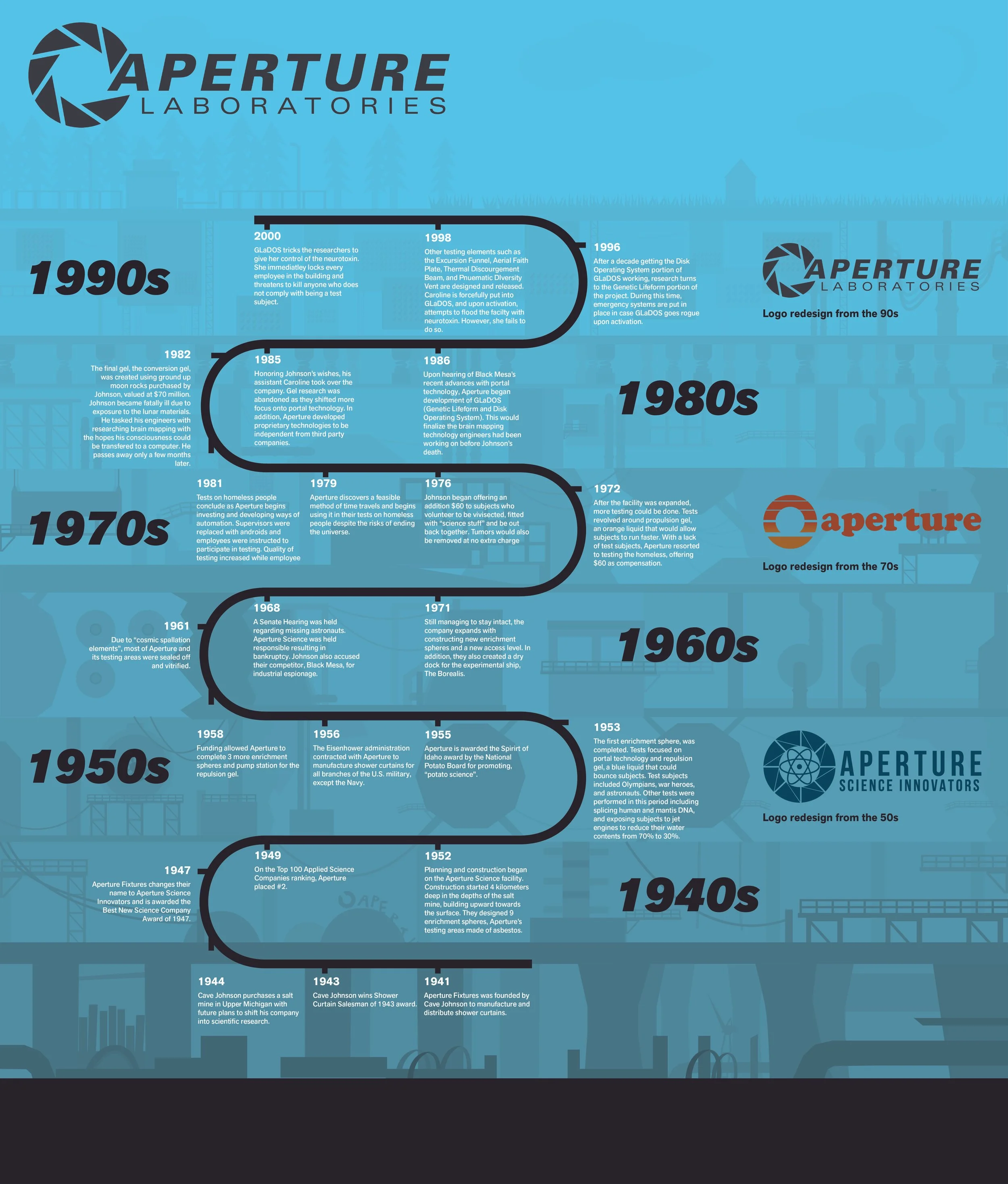
For my third draft, I focused on adding subtle background elements that show different places in the facility, accurate to what level and decade they’re from. The design is not without flaws yet, though. I tried to make the design easier to read by changing the color of the text to white. However, this had nearly the same effect as the black text due to the lighter and darker shades of blue
Final
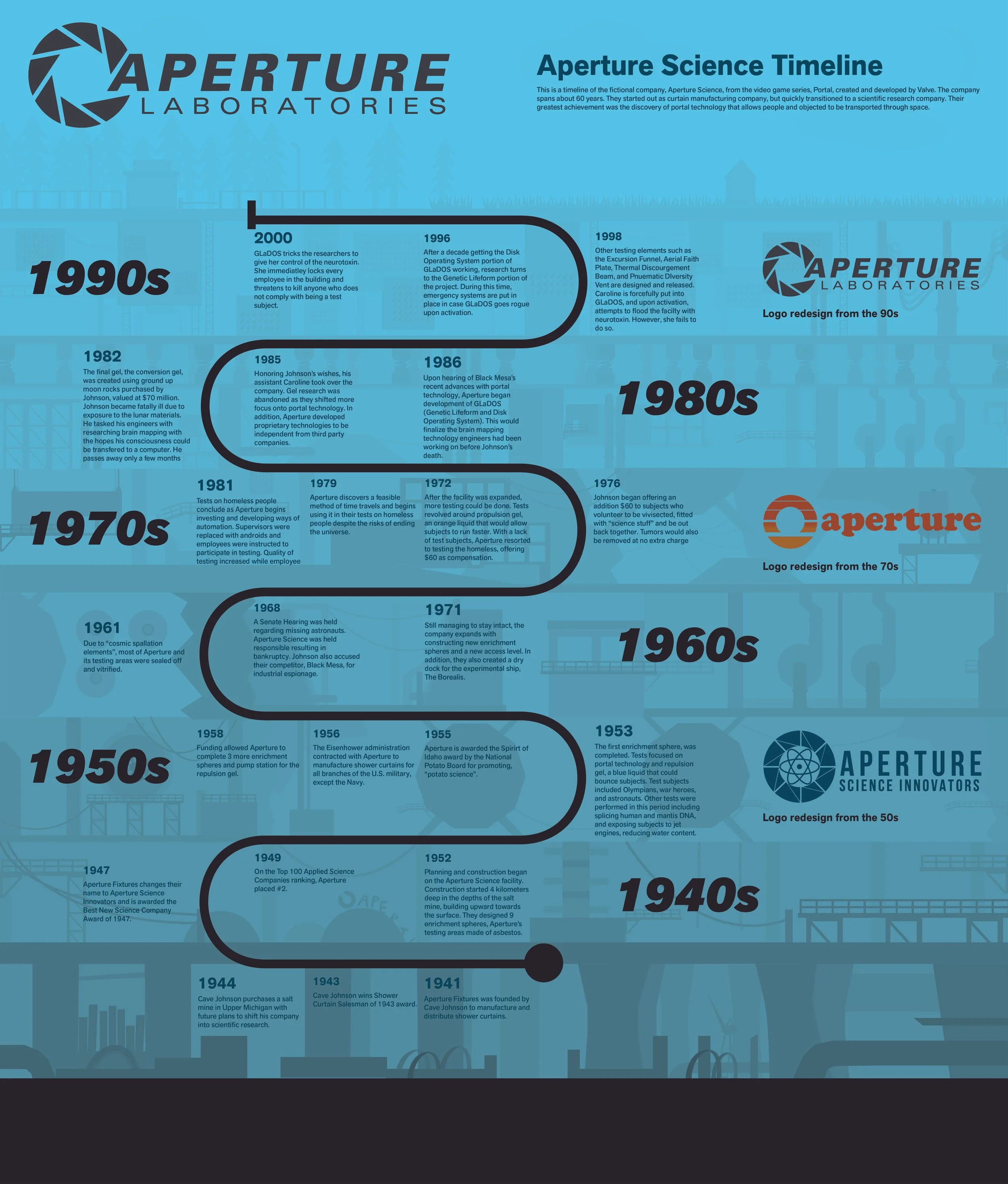
The final version saw me fixing up the readability issues with changing the color of the text to an off blue color that could be read easily throughout the whole poster. In addition, I also added a brief description of the company at the top of the poster to aid those unfamiliar with the source material. I also added circle at the bottom of the timeline to better indicate that the timeline could be followed from the bottom, up towards the top.