East Aurora Counseling Website
At East Aurora Counseling, I spent a large amount of my time dedicated to improving our website. I worked on it from the start of my internship in August of 2025 to the end of it in December of 2025.
Depending on when you are viewing this page, the website may have changed since my internship ended. However, I will provide the link here regardless: eastauroracounseling.com
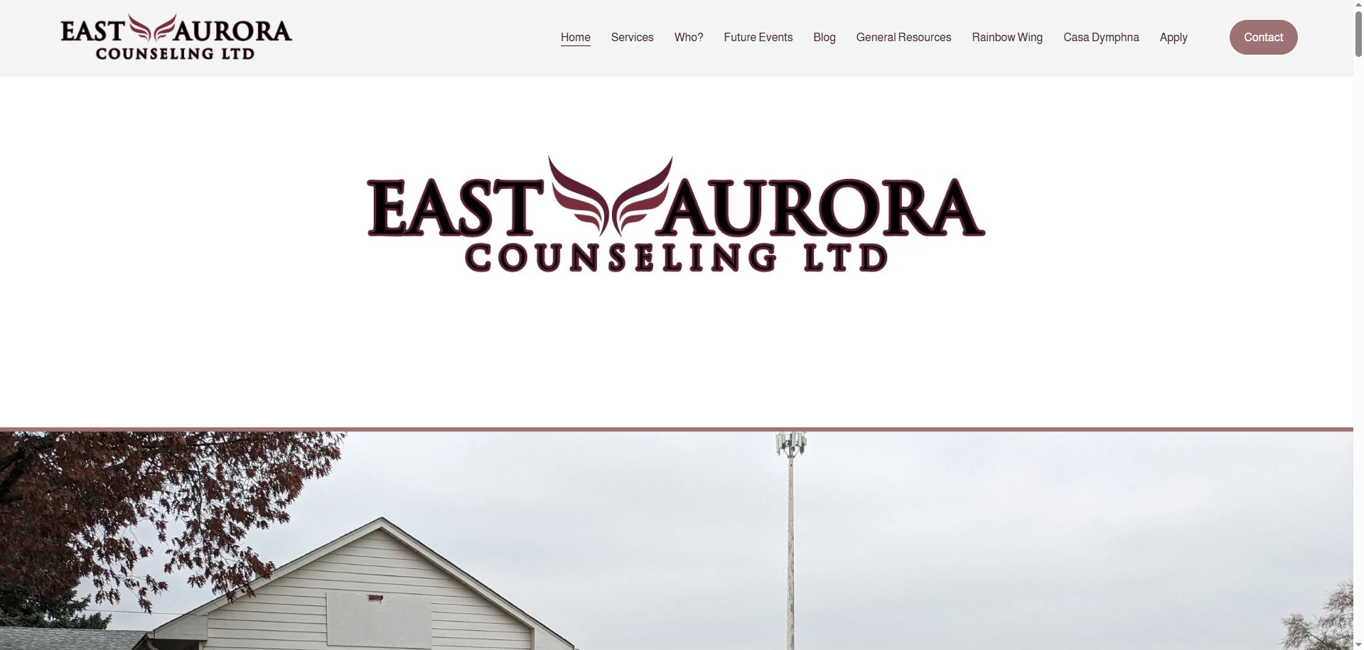
Homepage
The homepage was one of the first areas I tackled. Previously, the page lacked clarity and a clean flow of information to the viewer. I recitified this by reorganizing the information using hierarchy to sort what was most important. I would do this by bolding text, increasing or decreasing point size, and adjusting the space between the text to call more attention to certain areas.
I also added background elements to make the page more visually interesting. Previous to this, the page had simple beige backgrounds throughout the entire page, making it kind of bland to read through. I also added buttons to replace any links as these were often small and not emphasized.
Footer
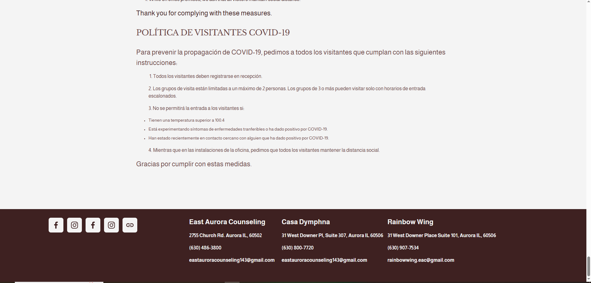
To make the footer of the website, I went through a few iterations before settling on the final design. The original footer had only the social media links as well as the information for East Aurora Counseling. These elements were off on the left hand side and in different sizes making the some information not as noticable. I aimed to solve these issues by speading out the information across the footer and making all info, minus the headings, the same size allowing for an equal share of attention.
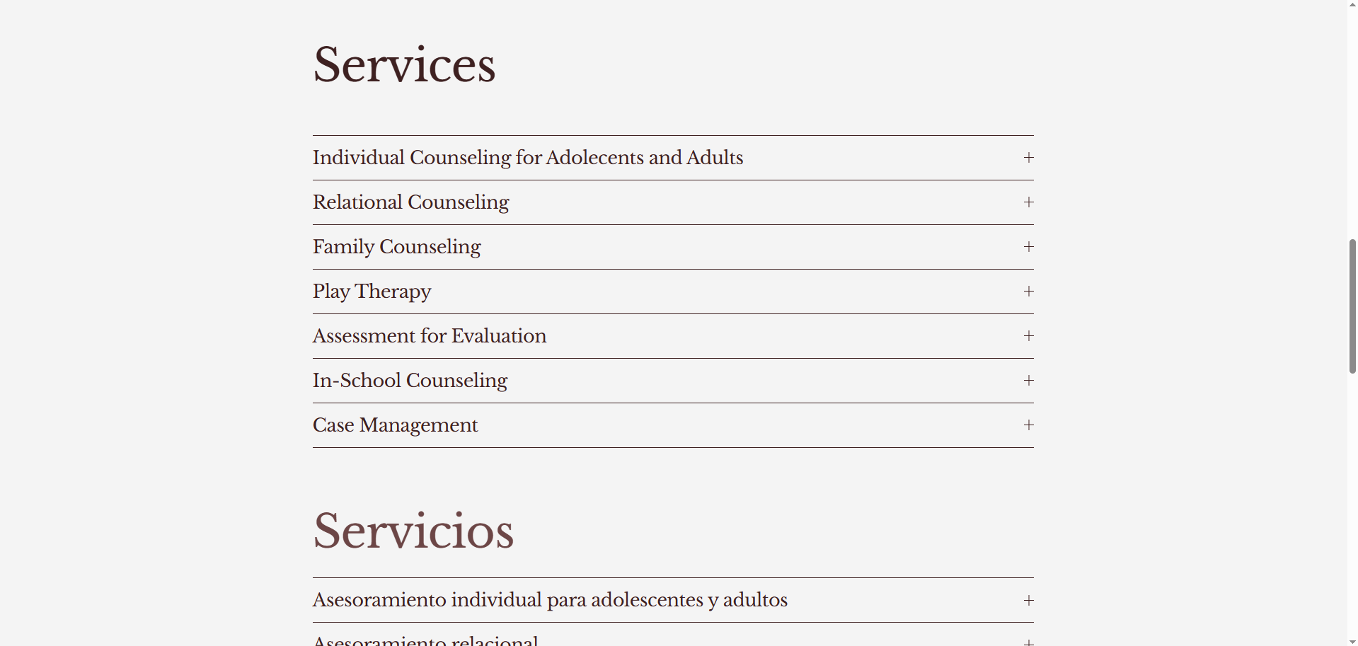
Services Page
The services page was something I had a lot of fun working on. The original page had a bulleted list of the services offered at EAC but did not elaborate on their meanings. I replaced this bulleted list with an accordian drop down menu. This allows users to expand each option and see more details about the services that are offered.
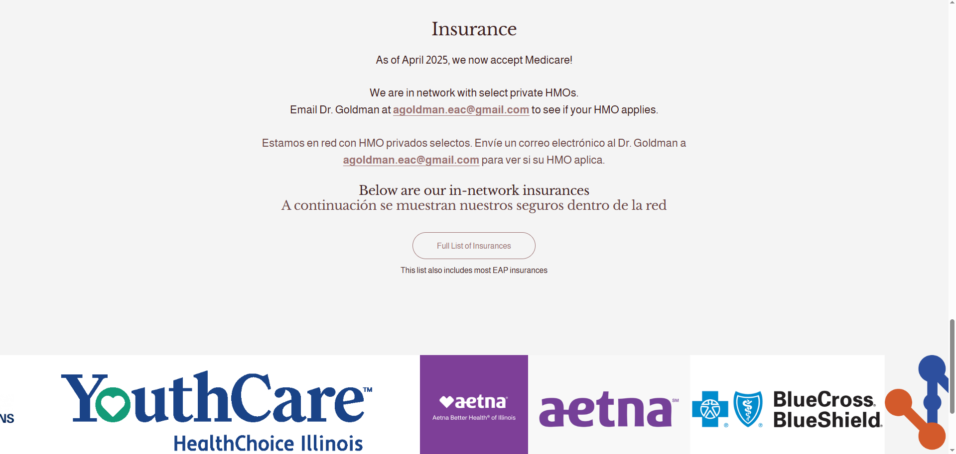
Another part of this page that I made changes to was the insurance section. I reorganized the information to flow more naturally. I also uses size and color of the text to call more attention to the important elements. Lastly, I added a collection of images at the bottom that displays the logos of insurances that EAC are in-network with. The user can scroll through these images adding both visual information, and an interactive element to the page.
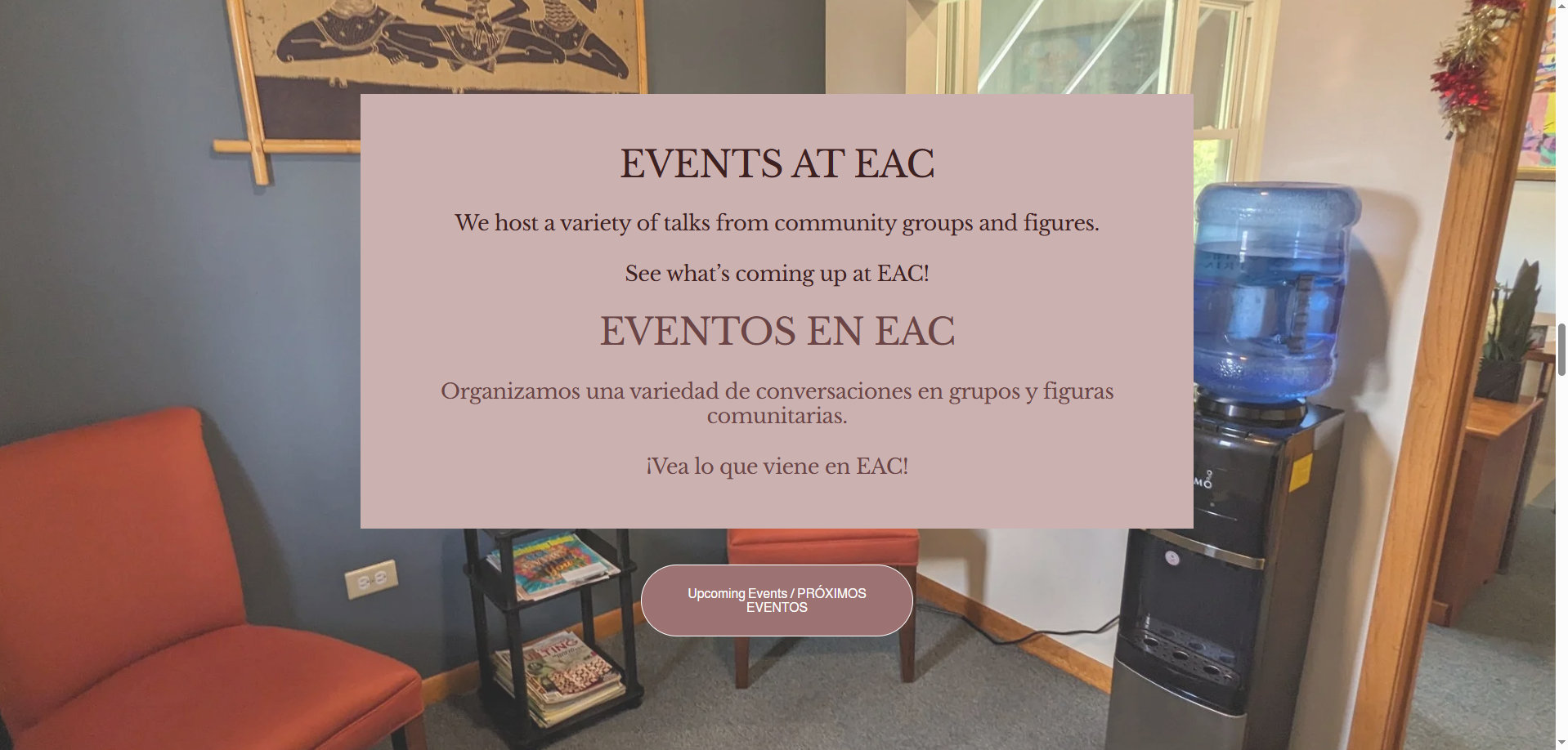
Upcoming Events Page
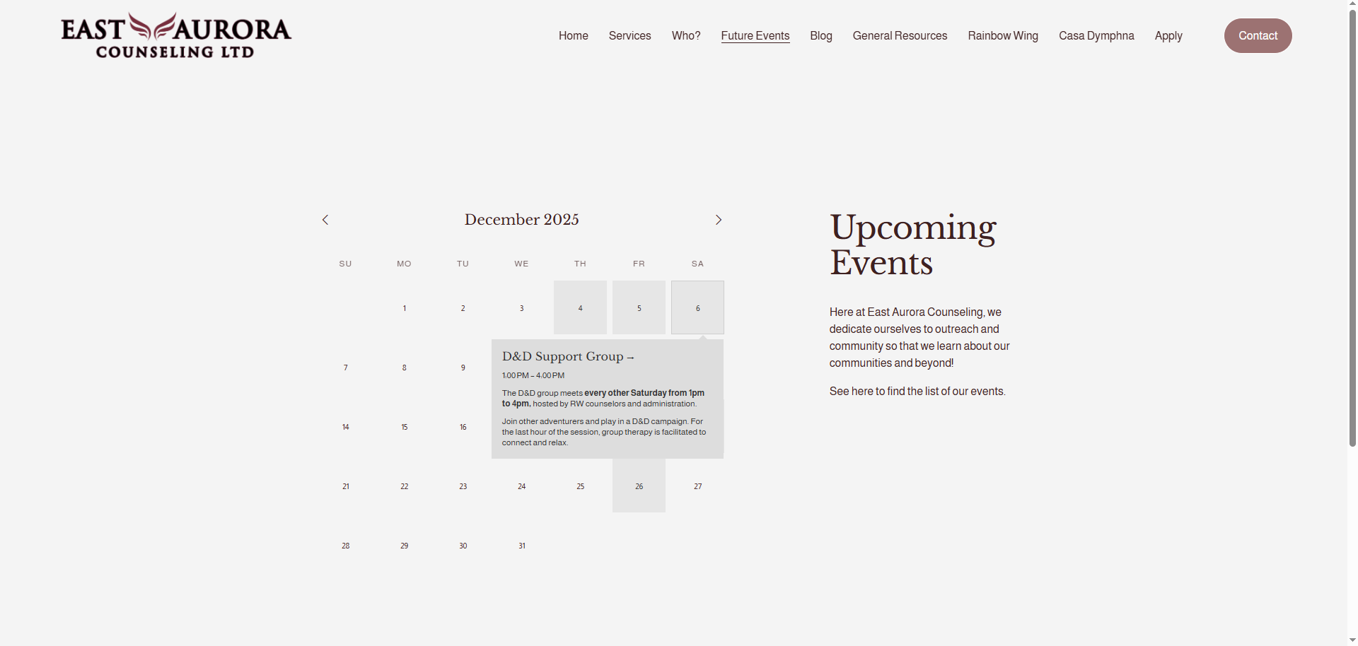
To update the Upcoming Events page, I completely redesigned it from the ground up. The old iteration saw a list of upcoming events bulleted with event names and dates. I replaced this list with a new calendar feature that organizes the events, helping with clarity. It is fully customizable for editors of the website, making adding future events simple. In addition to adding events to the calendar, it also displays event details like the date, title, and description. You can click into these as well, so users can view even more details where applicable. All old events are saved even past the event day, making it useful to recall events.
Marriage & Family Therapy Page
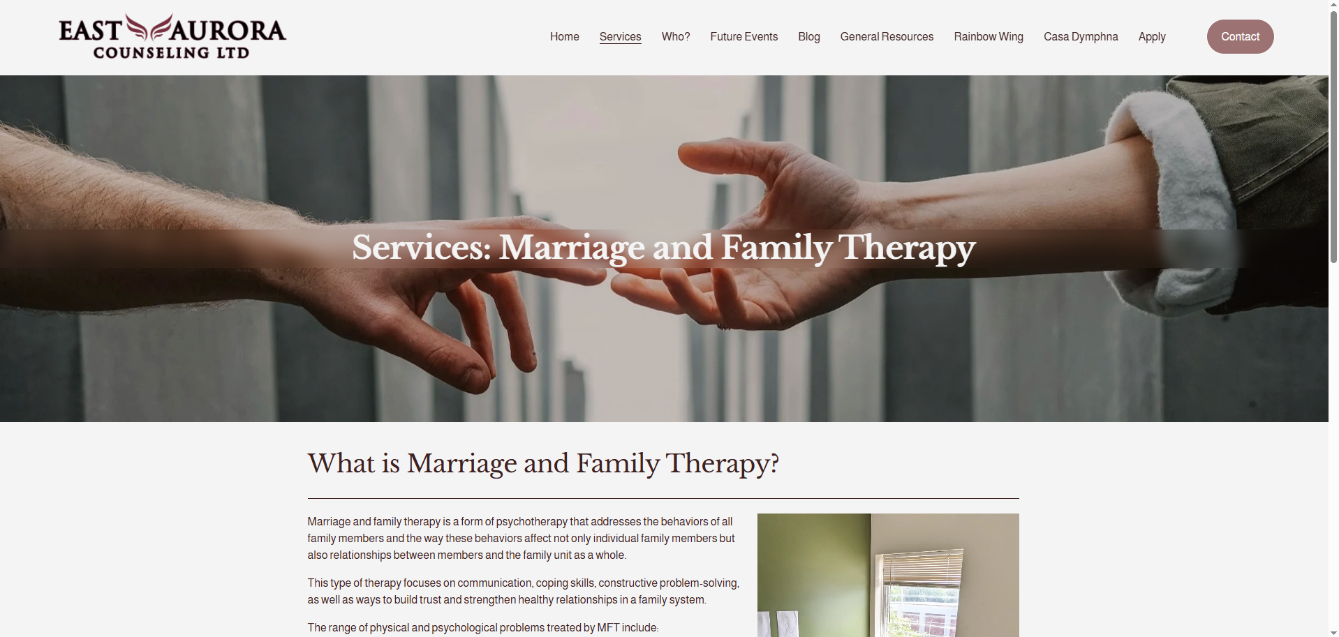
This page did not require too much editing compared to many of the other pages of the website.
The only major issues were the readability of the title, which I made easier by adding a blur effect behind the text, and some small format issues with the body text. This body text was previously one giant block of text, so to make this easier for the audience to take in, I added line breaks. This gives the reader spots to rest, making the information not as overwhelming to consume.
General Resources Page
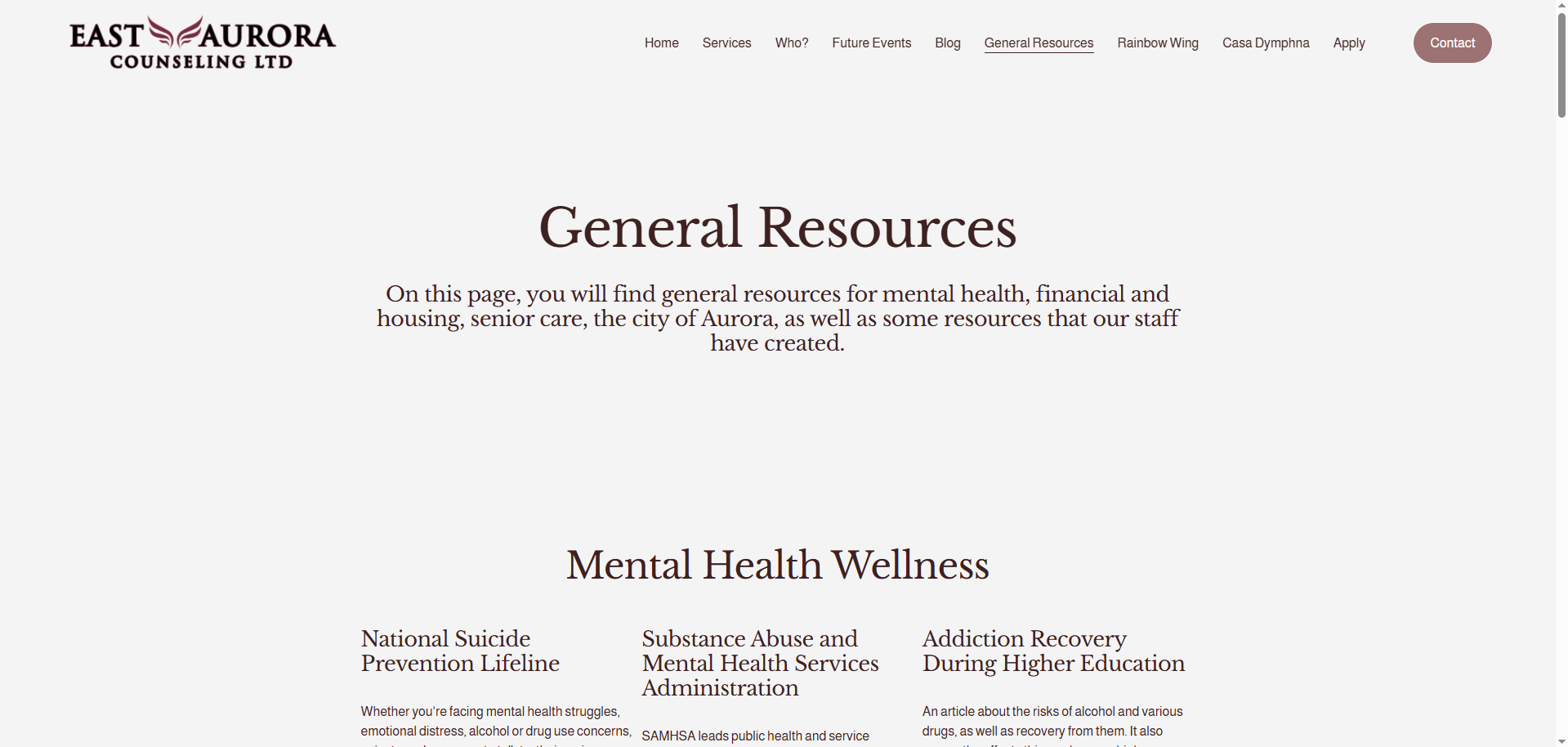
The General Resources page as well as the LGBTQIA+ Resources page required some of the most adjustment. These pages previously listed out resources and provided hyperlinks to them. I heavily imporved upon this by reformatting the pages. I categorized the resources into different subjects where they applied to make searching for particular resources easier for users.
On top of providing a title for the resource and a button linked to them, I also added a brief description of each resource to give users more of an idea of what the resource is about.
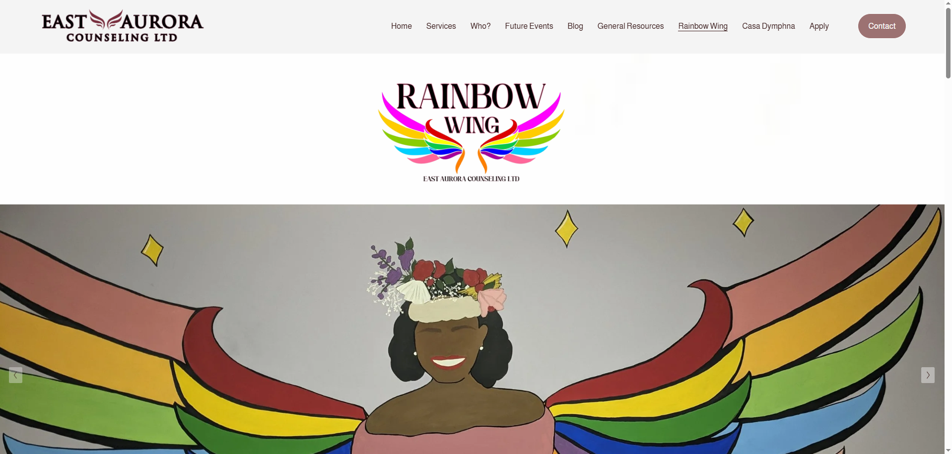
Rainbow Wing Page
The Rainbow Wing pages started in a pretty good spot compared to other pages on the website. I rearranged some of the sections of the page allowing for a better flow of information to the users. I also took photos of the offices and added those to the front page via a slideshow. This gives the audience to interact with the page by clicking through the images and provides helpful insight into what the building looks like.
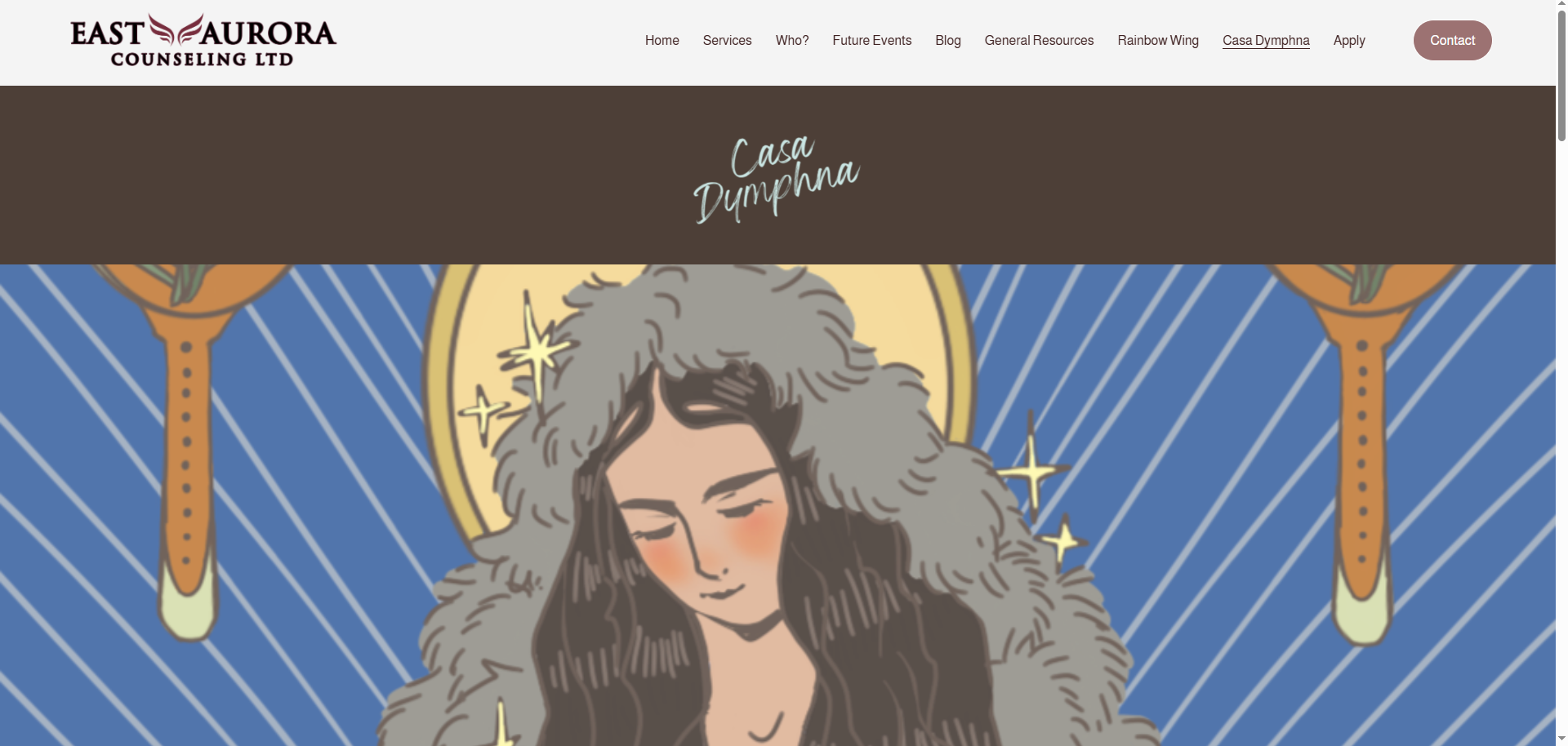
Casa Dymphna Page
One of the last things I did during my time at EAC was creating the Casa Dymphna pages on the website. The purpose of these pages were to give information about the Casa Dymphna site, what they can offer, and resources that we can provide to the spanish speaking community. Similar to the homepage and the rainbow wing page, I took photos of the offices and added them to the page to help users identify our location.