Font Poster
This is a project I made for my Intermediate Graphic Design class in the fall of 2025. The purpose of this project was to create a poster designed around a particular font. The poster should include some of the font’s history, details of the font’s typography, a comparison between the font and another font, as well as examples of the font’s many characters. Another rule was that all of the graphics used in the poster must be made out of text. From the selection of fonts available, I chose American Typewriter.
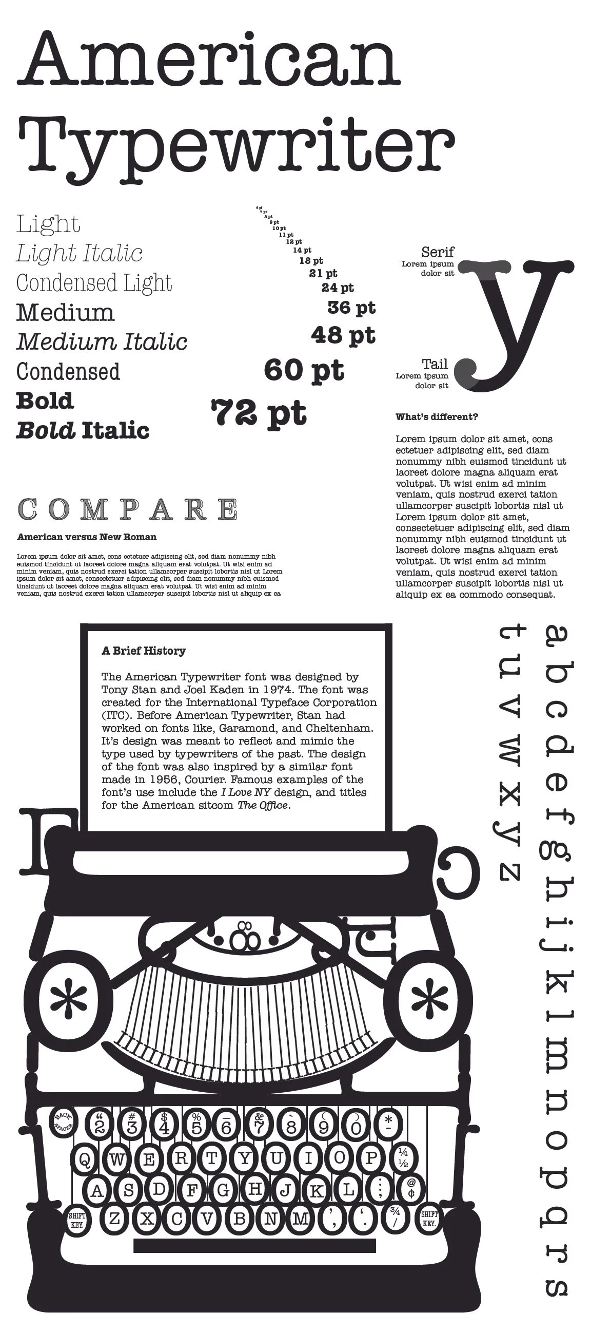
Draft 1
I made this first draft to highlight the various aspects of the typeface and create a good layout for where I would have my information. I chose to work in black and white to give it more of that older feeling associated with typewriters.
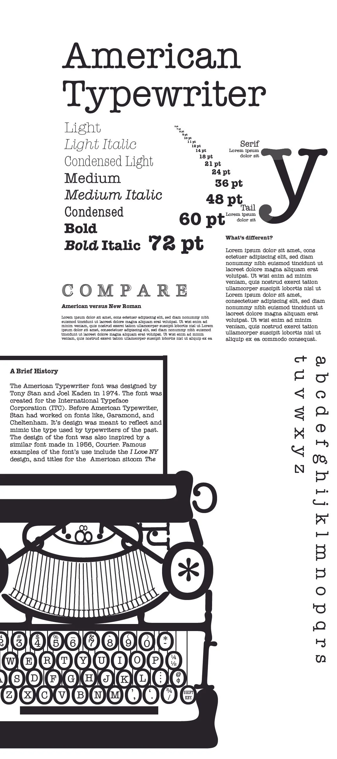
Draft 2
For this draft, my professor suggested I shift some of the elements to the right to give the viewer more room to breathe when reading through the poster. I think this new structure flows a little better, but it definitely needed a little more refinement to make it more complete. The middle area feels especially crowded with this new version.
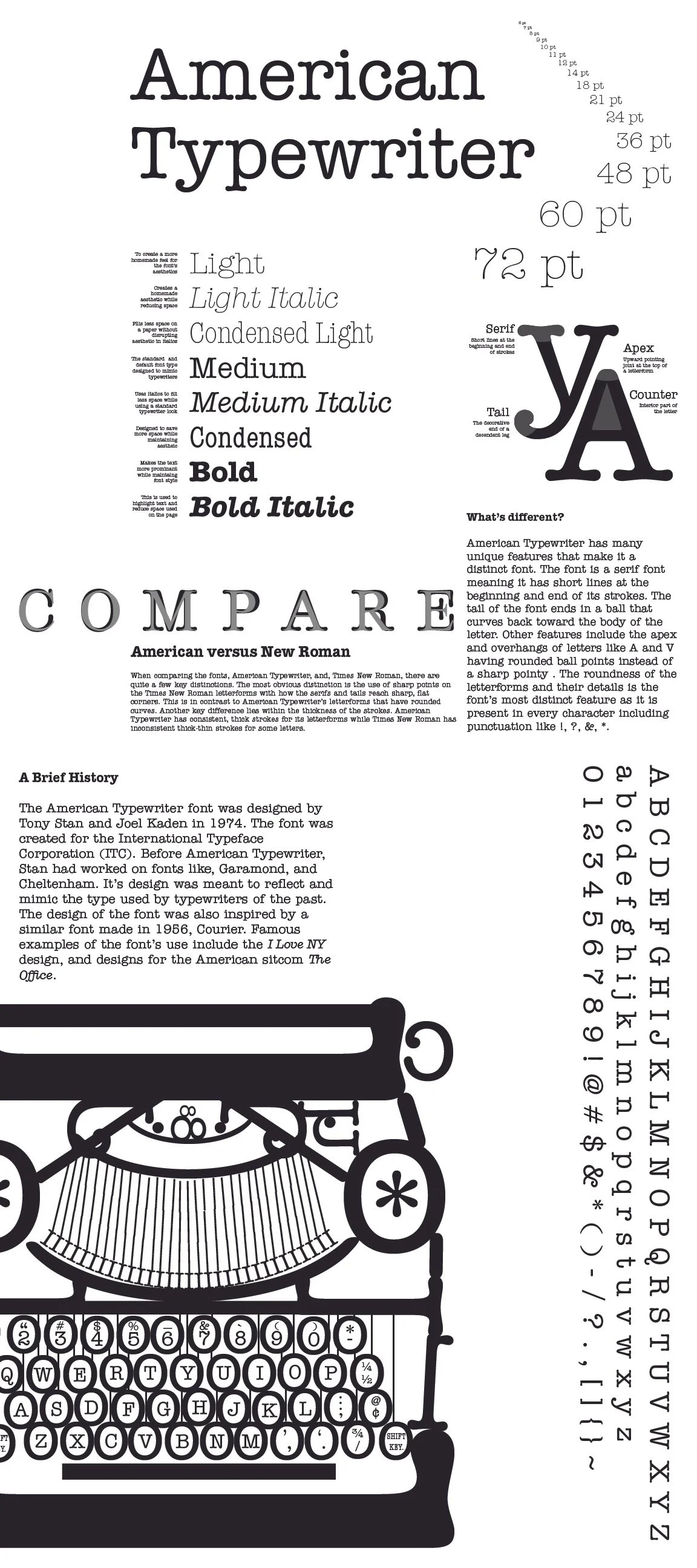
Final Design
After reviewing with the professor once again, I removed the black outlines around the paper part of the typewriter. The professor suggested this element was too distracting, so I was asked to remove it. In addition to this, the professor suggested I make the “COMPARE” text bigger to better grab the attention of the viewer. Beside the changes that my professor suggested, I added other elements to enhance the design like more information about what makes the font unique with details about the Y and A. I also did this for the weights of the type, outlining their use cases. Lastly, I updated the pt font section to be a light weight instead of bold. This allows the viewer to flow through the page better with only three points of interest (title, YA, and the typewriter).