U.S. Currency Project
I worked on this project in my Advanced Graphic Design class in the Spring of 2026. The purpose of this project was to redesign U.S. currency in the style of swiss design and international typography. The project required I make the front and back of the 1, 5, 10, 20, and 100 dollar bills. Another rule was to include elements that we as the designer feel are necessary elements that currency should have such as a serial number for security.
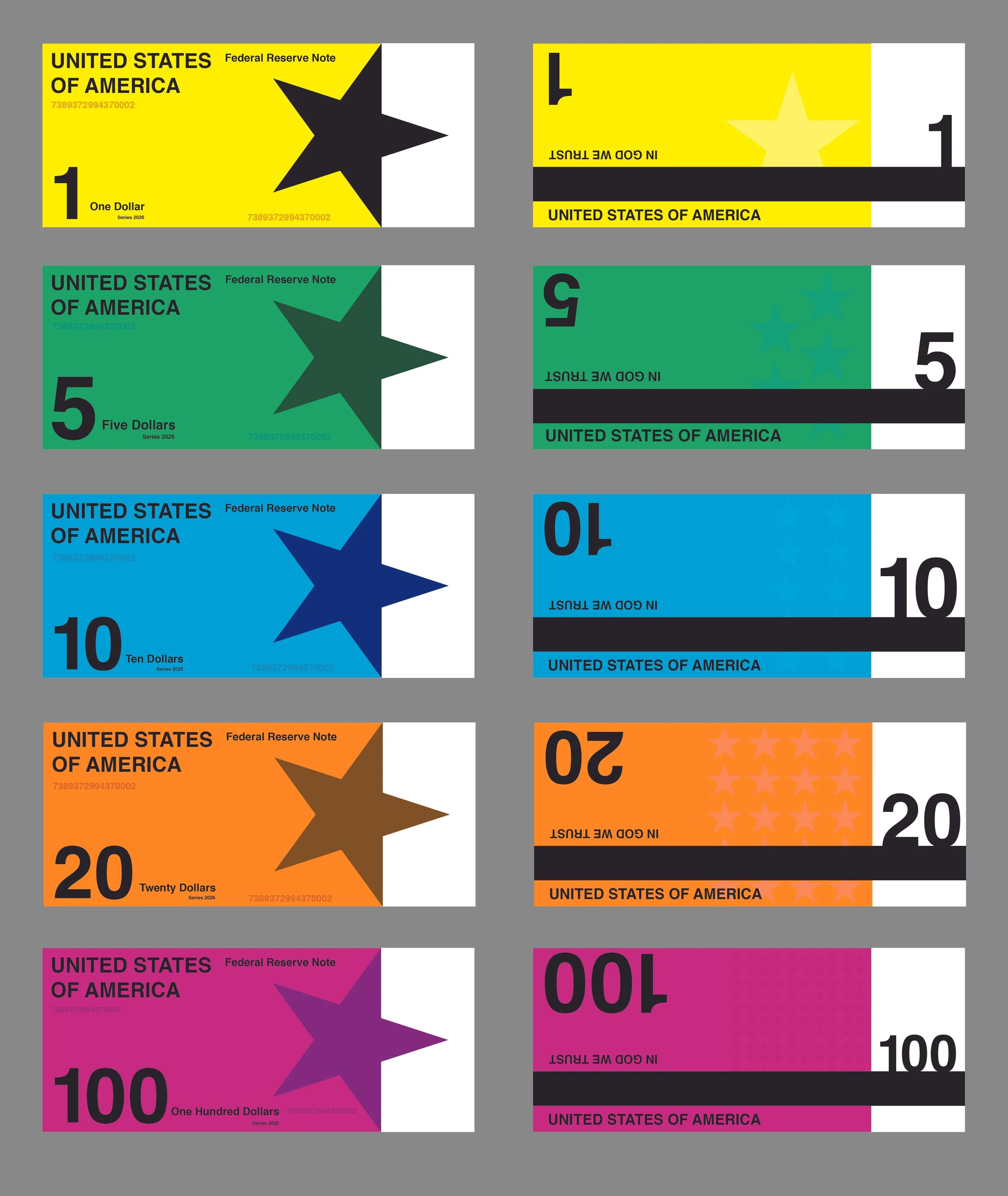
Initial Final
To follow the style of swiss design and international typography, I used simple shapes, basic colors, and sans serif fonts. I also included more subtle color differenced like with the stars on the back of the bills that are also reflective of the style. Because I was redesigning currency, I also took inspiration from more modern means of transactions like credit cards. In this sense, the stars reflect how arrows point towards where the card would be inserted into the reader. The black bar on the back of the bills also reflect this idea with how the card could be read by swiping it. I added necessary elements like the serial numbers and subtle stars to prevent counterfeiting. I also thought it was necessary to better distinguish each bill and its value by making each a different color.
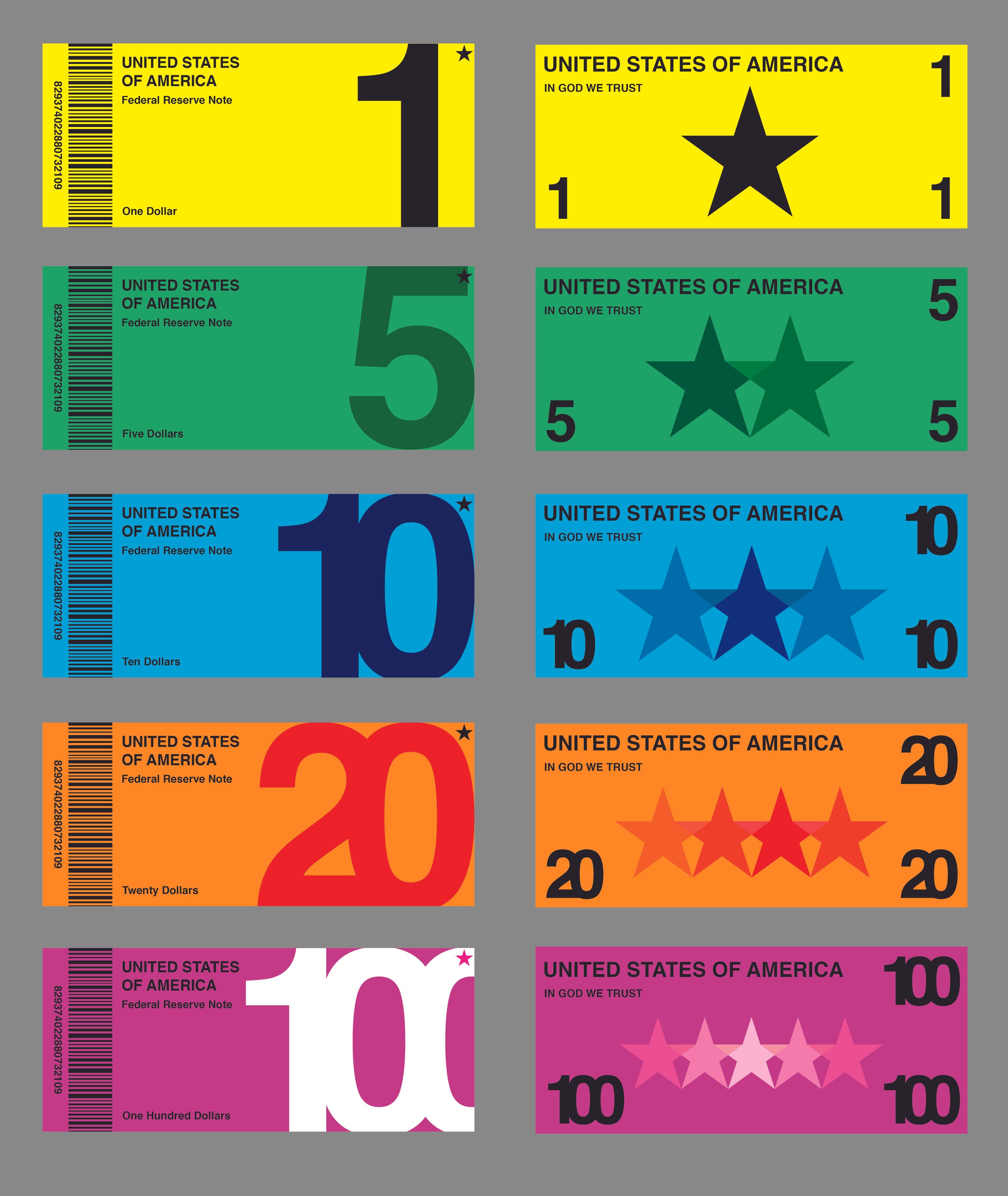
Updated Final
For my updated final design, I tried to lean even more into the aethetics of the swiss design and international typography styles. The styles use a lot of cross-blended colors, so I incorporated this with the stars seen on the back of the bills. I also increased the size of the stars, and made their colors more prominent as my professor said they were too subtle. My professor also indicated that the fronts and backs of my other designs did not feel distinct enough and could be mistaken for one another. To solve this problem, I made the front have one large number and the back have several numbers to better indicate a difference between the two sides. As far as security measures, my professor said the first one lacked in this are as well. In an attempt to solve this issue, I added a barcode alongside the serial number that could be scanned to prevent counterfeiting the bills. Overall, the design works way better than the original as it better reflects the styles, generally flows a lot better, and has increased security measures.